

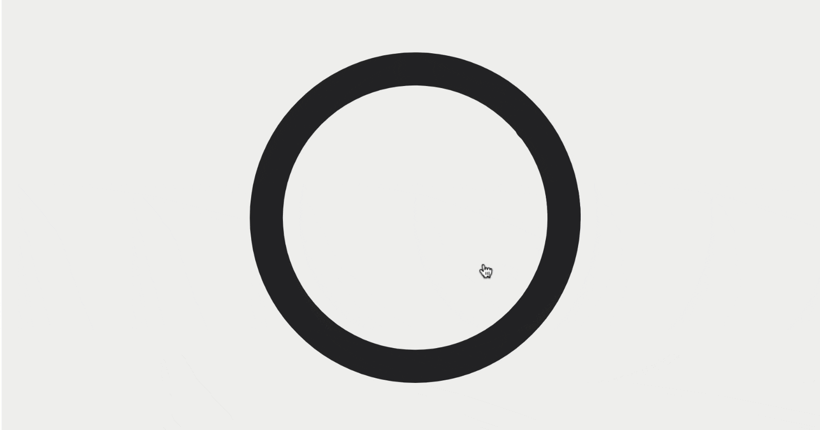


In this tutorial, we'll create a simple checkbox that transforms from a circle to a tick. As we create this we'll learn a little bit about motion.js and a little about SVGs too. You will need basic knowledge of React to follow along
Check out the finished code on Codesandbox here
1. Create The Icon
I created this icon in Figma, but you could use any vector-based design program (e.g. Adobe Illustrator or Affinity Designer) You can even create the SVG code from scratch if you're an SVG pro. It's worth knowing how SVG code works even if you do use a design program as you often need to clean the code up a little. If you don't have any design software you can use my SVG code below.
Create a new 20x20 artboard and draw these three paths
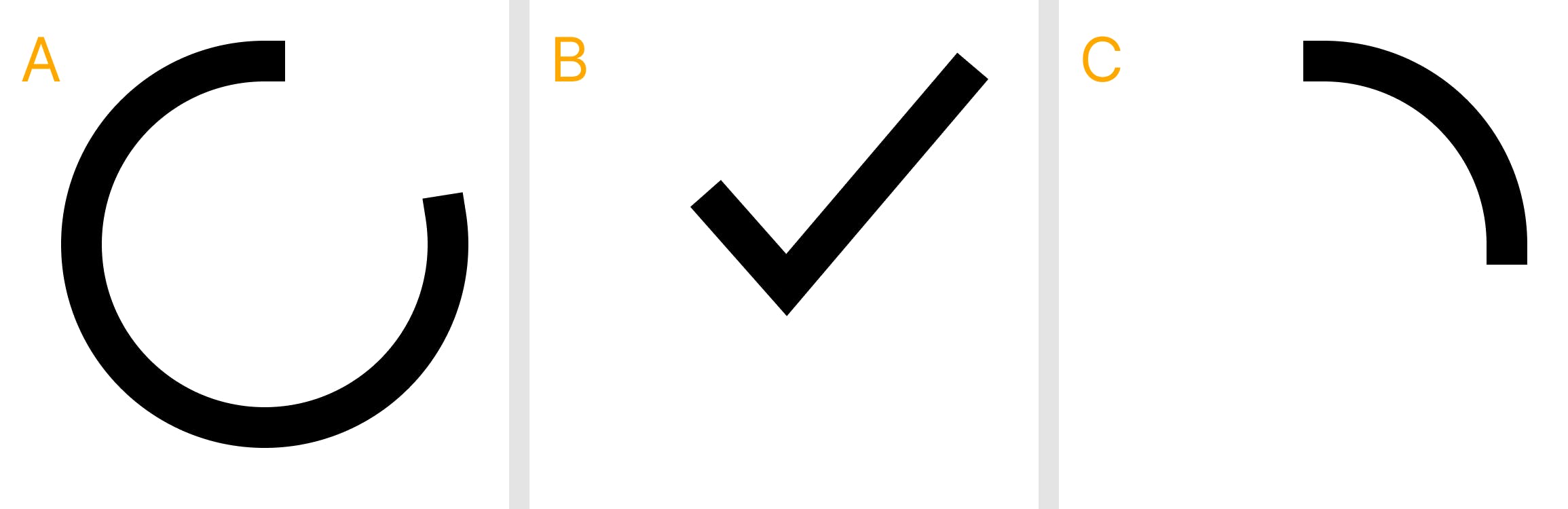
When these three paths are overlaid your artboard should look like this
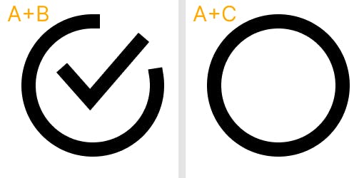
The advantage of creating this checkbox with three separate paths is that we can remove a path to create the checked and unchecked options. So we'll either be showing the A+B paths or the A+C paths as shown below.
A couple of things to remember when creating your checkbox.
- Use the path tool! we'll be animating the length of the path so don't use squares and circles. use actual paths.
- When you create a path the first point you create will be where the animation will start from.
To save as an SVG in Figma:
- Right-click on the artboard in the layers panel
- Select
Copy/Paste as - Select
Copy as SVG
you can now paste this code directly into HTML. It should look something like this.
<svg width="20" height="20" viewBox="0 0 20 20" xmlns="http://www.w3.org/2000/svg">
  <path
    d="M10 1C5.02944 1 1 5.02944 1 10C1 14.9706 5.02944 19 10 19C14.9706 19 19 14.9706 19 10C19 9.66199 18.9814 9.32833 18.9451 9C18.9298 8.8614 18.9113 8.72374 18.8897 8.58711"
    stroke="black"
    stroke-width="2"/>
  <path
    d="M17 4.4L10 12L7 8"
    stroke="black"
    stroke-width="2" />
  <path
    d="M19 10C19 5.02944 14.9706 1 10 1"
    stroke="black"
    stroke-width="2"/>
</svg>
note: I've kept the paths in the order A,B,C as shown in the first image of this article to make it easier to follow. I'll call them Path A, Path B and Path C
We can make some modifications to this SVG code:
- Firstly we can remove the width and height arguments. By removing them from the SVG code we can control them using CSS instead. The exact position of the points in our paths will be relative to the
viewBoxargument, so we can scale our icon to be as big or small as we want without changing the icon. - We can replace
stroke="black"withstroke="currentColor"this way we can control the colour of the path stroke directly in CSS too. We could even make it change color on hover etc... in CSS if we like. - We should add
fill="none"to each path. We don't want the paths to ever have a fill color, so if we explicitly tell it to have no fill we won't accidentally add it in with CSS or any other way. - If we like we can change the thickness of the path with the
stroke-widthargument. but let's leave it at 2 for now. - And we can give the paths a rounded end by adding
strokeLinecap="round" - d is the coordinate of each path of the point. I wouldn't touch those. but you can try making small tweaks to these numbers, just to see how it changes the icon.
now after some manual adjustments, we have some SVG code that looks like this. Feel free to copy it and use it yourself if you don't have any design software. Or if you want to skip this first step.
<svg viewBox="0 0 20 20" xmlns="http://www.w3.org/2000/svg">
  <path
    fill="none"
    strokeWidth="2"
    strokeLinecap="round"
    stroke="currentColor"
    d="M10 1C5.02944 1 1 5.02944 1 10C1 14.9706 5.02944 19 10 19C14.9706 19 19 14.9706 19 10C19 9.66199 18.9814 9.32833 18.9451 9C18.9298 8.8614 18.9113 8.72374 18.8897 8.58711" />
  <path
    fill="none"
    strokeWidth="2"
    stroke="currentColor"
    strokeLinecap="round"
    d="M17 4.4L10 12L7 8" />
  <path
    fill="none"
    strokeWidth="2"
    stroke="currentColor"
    strokeLinecap="round"
    d="M19 10C19 5.02944 14.9706 1 10 1" />
</svg>
Now let's add our SVG to a React project
2. Create A Checkbox Component in React
Create a new React project (or open an existing one) and add a new component called Checkbox.jsx
now let's add our SVG code into this file like this
export default function Checkbox() {
  return <svg ...>
     ...
  </svg>
}
cool. Step 2 complete! but first, let's see how we would switch between the checked and unchecked states without any animation.
First, we can import useState, create a boolean state for checked and change the state when we click the svg. Then our code will look like this
// import useState
import { useState } from "react";

export default function Checkbox() {

  // booled state called `checked` and set it to false
  const [checked, setChecked] = useState(false);

  // function to change the checked state on click
  const handleClick = () => {
    setChecked((prev) => !prev);
  };

  // bind the handleClick function to the svg element
  return <svg onClick={handleClick} ...>
     ...
  </svg>
}
Now we can switch between the two icon states by conditionally hiding either path B or path C depending on the react state. Our code will now look like this
import { useState } from "react";

export default function Checkbox() {

  const [checked, setChecked] = useState(false);

  const handleClick = () => {
    setChecked((prev) => !prev);
  };

  return <svg onClick={handleClick} viewBox="0 0 20 20" xmlns="http://www.w3.org/2000/svg">
    <path
      fill="none"
      strokeWidth="2"
      strokeLinecap="round"
      stroke="currentColor"
      d="M10 1C5.02944 1 1 5.02944 1 10C1 14.9706 5.02944 19 10 19C14.9706 19 19 14.9706 19 10C19 9.66199 18.9814 9.32833 18.9451 9C18.9298 8.8614 18.9113 8.72374 18.8897 8.58711" />
    {/* only show path B when checked */}
    {checked &&
      <path
        fill="none"
        strokeWidth="2"
        stroke="currentColor"
        strokeLinecap="round"
        d="M17 4.4L10 12L7 8" />
    }
    {/* only show path C when not checked */}
    {!checked &&
      <path
        fill="none"
        strokeWidth="2"
        stroke="currentColor"
        strokeLinecap="round"
        d="M19 10C19 5.02944 14.9706 1 10 1" />
    }
  </svg>
}
If you import this component into a react project you'll see an icon that changes when you click on it. yay! but it doesn't animate yet! booo!
Also, it's huge. Go ahead and add some style to control the size of your icon.
<svg style={{ width:60 }} ... >
this will work. or you could create a CSS class
3. Animate The Icon Already!
now we'll add framer motion to our project by typing this in the terminal
npm i framer-motion
now let's import this at the top of our component like this
import { useState } from "react";
import { motion } from "framer-motion";

export default function Checkbox() {
   ...
}
Now you can turn any HTML or SVG element into a motion element. A motion element works exactly the same as the existing HTML or SVG element but you can pass some awesome new props for animations and gestures. Let's try that now. To convert a path element we simply add motion. like this motion.path So if we convert path B and path C into motion elements (remember A doesn't animate) our code will look like this:
import { useState } from "react";
import { motion } from "framer-motion";

export default function Checkbox() {
  ...
  return <svg onClick={handleClick} viewBox="0 0 20 20" xmlns="http://www.w3.org/2000/svg">
    <path ... />
    <motion.path ... />
    <motion.path ... />
  </svg>
}
That's great. We now have two motion elements. But they don't animate yet. Let's send them both some animate props and see some magic. Animate props work just like style props, you can use it to add styles and those styles will animate in. There are some fun ones too like rotate or scale
Let's try a couple of crazy ones out just for fun. Notice we now have a rotate animation on path B and a scale animation on path C
Run this code and check it out:
import { useState } from "react";
import { motion } from "framer-motion";

export default function Checkbox() {

  const [checked, setChecked] = useState(false);

  const handleClick = () => {
    setChecked((prev) => !prev);
  };

  return <svg onClick={handleClick} viewBox="0 0 20 20" xmlns="http://www.w3.org/2000/svg">
    <path
      fill="none"
      strokeWidth="2"
      strokeLinecap="round"
      stroke="currentColor"
      d="M10 1C5.02944 1 1 5.02944 1 10C1 14.9706 5.02944 19 10 19C14.9706 19 19 14.9706 19 10C19 9.66199 18.9814 9.32833 18.9451 9C18.9298 8.8614 18.9113 8.72374 18.8897 8.58711" />
    <motion.path
      fill="none"
      strokeWidth="2"
      stroke="currentColor"
      strokeLinecap="round"
      animate={{ rotate: 45 }}
      d="M17 4.4L10 12L7 8" />
    <motion.path
      fill="none"
      strokeWidth="2"
      stroke="currentColor"
      strokeLinecap="round"
      animate={{ sclae:0.2 }}
      d="M19 10C19 5.02944 14.9706 1 10 1" />
  </svg>
}
You'll notice it now runs the animation only once on page load. We can make the animations conditional by adding a simple ternary operator like this:
...

export default function Checkbox() {

  ...

  return <svg onClick={handleClick} viewBox="0 0 20 20" xmlns="http://www.w3.org/2000/svg">
    ...
    <motion.path
      ...
      animate={{ rotate: checked ? 0 : 45 }}
      ...>
    <motion.path
      ...
      animate={{ scale: checked ? 1 : 0 }}
      ... />
  </svg>
}
now you can see the two crazy animations take place when you click the SVG. Well, let's get back to animating the paths in and out. We can animate in and out the pathLength of the SVG paths and we should get the desired effect. give this a try:
  ...
    <motion.path
      ...
      animate={{ pathLength: checked ? 1 : 0 }}
      ...>
    <motion.path
      ...
      animate={{ pathLength: checked ? 0 : 1 }}
      ... />
  ...
Pretty cool, right? Our icon now animates. You can see the finished thing on Codesandbox here
From here you can try changing the duration or the easing of the animation using the transition props.
Check out Framer's awesome documentation here
Or let me know if you'd like me to make a more complex tutorial.